Film Analysis: Gravity (2013)

Having heard about this film, directed by Alfonso Cuaron, and starring Sandra Bullock and George Clooney, I wanted to catch it in the cinema in full big screen 3D glory, but it was not to be, so I had to wait until we could get the blu-ray and finally found out what all the fuss was about.

The film is about a scientist on her first space mission, who, after an incident with some space debris which destroys the shuttle, finds herself alone, floating in space, with no communications with Houston.

The opening shot of the film set the scene for the filming style of the whole film – a shot of part of the earth from space, held for a very long duration, whilst the audio of comms transmissions was overlaid. This opening shot is held for a very long time, and although this made me feel slightly uncomfortable it served a couple of purposes. Firstly the dialogue introduces the characters and gives you a bit of background on what they are doing, and also I think it hold so long on a long shot of earth from space, giving the viewer time to realise the enormity of space, and the beauty of earth The camera eventually reveals astronaut Matt Kowalsky and his colleague, scientist Ryan Stone, working on the outside of the Hubble Telescope, during a routine spacewalk with another crew member.  The long shots and gentle, floating recomposition of the shots in camera, as the camera moves around the actors, rather than through cutting and changing camera position helps to bring the viewer into the action, and make them feel as though they are actually up there in space, as another crew member.  This is also heightened by the almost constant camera movement as it floats around, moving in a similar way to the actors on screen in their micro-gravity environment.

The opening shot actually continues on this way for the first 15 minutes or so of the film, from the gentle floating through to the more dramatic camera moves after the shuttle is hit by space debris caused by the Russians blowing up one of their old satellites. At this point the moves of the camera again mirror the moves of the characters, not copying their moves, but moving in a similar fashion, turning to see debris hurtling towards the camera and actors.  In particular I liked the way the camera followed Stone as she spun on her own further out into the blackness of space, and then moved closer to her, in towards her helmet, and then around the side and inside her helmet becoming the view from her eyes, moving from an objective viewpoint of her in space into a point of view shot without a cut between the angles.

Stone is mourning her young daughter who she lost in a tragic accident, and down on earth finds herself just going through the motions – she gets up, goes to work and then when she leaves, just drives and keeps on driving. When she finds herself floating in space, rapidly running out of oxygen, she struggles to find reasons to fight for her life, and a couple of times during the film finds herself in a “rebirth” moment, the first after making it to the International Space Station and having had to let go of Kowalsky, to ensure that one of two of them survives.  She makes it into the airlock of the ISS, and after stripping out of her space suit, curls up in a foetal position in the womb-like interior of the airlock – I did find this a little too obvious and contrived (there’s even a hose floating around looking a bit like an umbilical cord!) but at least the symbolism was nice and obvious. After finding her way to Soyez she finds a renewed vigour for life, and the camera moves as she passes through the ISS are superb, floating and following her again like another member of the crew floating alongside her, at time slightly disorientating, but utterly fascinating.  Watching it in 3D on blu-ray as I was, I was totally absorbed by it all.  This realism went a long way to making me feel for Stone, I was actually on the edge of my seat at points, willing her to survive.

Stone has another moment where she tries to give in to death, when she realises that Soyez doesn’t have the fuel she needs to get her to the Chinese space station, and her best hope of a return to earth.  After a conversation with an inuit (totally unrelated to the space program and on comms due to crossed wires) she asks him to sing her a lullaby and switches off the lights, turns off the oxygen and hopes to fall asleep never to wake up.  But then Kowalsky visits her hallucinating dreams and brings her back to reality awakening a long forgotten memory from her training, which would give her the means to reach the Chinese vessel.

The film ends with another rebirth moment after Stone ditches into the lake, as she’s struggling to get out of her space suit which is holding her underwater a frog swims past with ease, and Stone follows him shortly after, rising up to the surface to take her first proper breaths of air back down on earth.   She then makes it to the shore and after rediscovering that she is now subject once more to full gravity on earth, she rises and takes her first, unsteady steps on the soil of earth, feeling a new joy for life.

It’s been a while since I felt so involved in a film that I would feel on edge for the main characters and this film did it for me, the CGI on it is phenomenal, and having watched the “making of” special features, it’s easy to see that it’s a ground-breaking film, having even used car manufacturing robots for some of the cameras!  The direction of the shots really makes the film though, the long involving shots, holding with the characters for almost too long, and it totally brings the viewer in, so absorbing. The audio plays a massive part too, silence is used very effectively – cutting out when the comms are cut with Houston, or when Kowalsky opens the hatch into Soyez.  It makes the viewer feel uncomfortable, something is not right, and it goes towards building the drama. The attention to detail, in particular with the lighting is fantastic, and the lighting brings an amazing depth to the film.

This is one film that I will be watching again, and enjoying a second time, it’s beautifully filmed, and created, the lighting is stunning and the CGI amazing.

Project 7: Exercise – Images with Depth

It’s exercises like this that push the arty side of my photography to come out, and give me a bit of a headache on the way, trying to figure out how to put the words on the page from the course handbook into imagery that meets the criteria!

For this one I needed to look not only at the lighting, but also at the contrast that can be created by different areas of texture and colour, either from their placement within the scene, or from how they are lit, colour, angle etc… of the light.

It asked me to think  specifically about the sense of depth within the image, and try to produce three images that each represented one of the following atmospheres:

  • Dynamic/Exciting/Adventurous
  • Oppressive/Dull/Stifling
  • Complicated/confusing/uncomfortable
  • Refine/Mature/Reasonable

I could use either video or stills, and I opted to just capture stills, and planned a few ideas.  I also decided that I would go back through my archive and find images that I already have that will work too, so the images below are a mix of old and new.

Click on the individual images to see my thoughts.

The best way to get depth into an image is definitely a combination of lighting and composition such as use of reduced depth of field to separate out layers. The visual depth of a shot can make a real difference to a shot – the whole point of the “grammar of film-making” is to ensue that the viewer doesn’t think about the mechanics of the film, they should just be so involved in watching it that they don’t notice how it has been made.  We as humans view real life in 3D, we see layers and depth in the world around us, and if that can be recreated on the screen (without 3D technology) then what is on the screen will be more believable.

Project 7: Exercise – Depth with lighting

Lighting plays a big part in creating depth, whether it’s through the use of minimal pools of lighting to highlight certain objects or subjects on screen, or whether it’s through lighting the whole scene to show even distant objects.

One film that really uses light to create mood and depth to a scene is the Film Noir thriller The Third Man (1949), and I also like the use of light in Schindlers List, which also had a Film Noir feel to some of the scenes, and The Colour Purple is stunning too.

For the practical part I had to play around with lighting a scene in a small dark space.  I’d have liked to used live subjects, but I have a rather camera shy husband, so I had to make do with what I could find in the living room.  The lighting I used was a rather odd setup.  The constant light I used was a little domestic spotlight with a daylight balanced  bulb in it that I use for my sewing room, and I also used the light on my phone, which is a slightly warmer light, so there is a little bit of mixed lighting going on, but not too bad.

Even though the depth of field is too narrow to really show the rear subject clearly I particularly like the first and second shots, the top down lighting gives it a bit more drama, but I like the separation of the two different colour temperatures too.

Although I’m happy with lighting these closer in subjects and separating them with the light, I intend to have a play around more with larger scenes and spaces, when I find a suitable spot and some willing  subjects!

Project 7 – Depth

With the TV or cinema screen being flat and naturally 2 dimensional (unless you go to a 3D movie with the special gigs on!) making the image in screen seem more “real” can be achieved by creating depth in the scene.  there are a number of different ways of doing this, positioning subjects or key objects at different distances away from the camera and adding perspective into the shot.

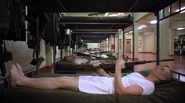
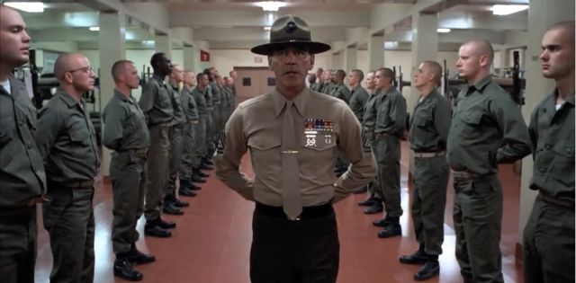
Stanley Kubrick used perspective very effectively in many of his films, to give a feeling of space and distance, such as in Full Metal Jacket.

Full Metal Jacket - Single point perspective use by Stanley Kubrick

In the first of these shots he shows the size of the room, and the number of beds, giving the viewer a feel for how many guys are involved, whilst still concentrating the viewers eye on one main character at the front of the shot, giving them more importance in the scene,  Had this been shot from a different, wide angle, by moving the camera 90 degrees to the right, head on to the beds, with all of the beds on the same plane of focus from the camera

Library-2843

This shot is similar in that Kubrick again uses single point perspective (the lines of perspective disappearing off to a single point in the centre of the shot) to show the numbers involved, but giving prominence to the most important character on screen.  The lines of soldiers also serve to frame the drill sergeant, again giving him the prominence on-screen, showing that he’s the one in power.

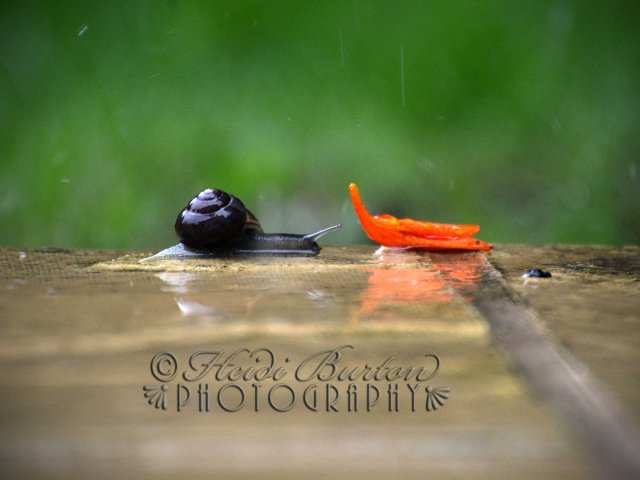
Another way of showing depth in a scene is by using selective focus and depth of field to separate subjects and/or backgrounds or other subjects.  It’s a technique I’ve used a lot in my stills photography, achieved by using a large aperture, say around f.2.8 and the lens on a longer zoom, which will also compress the distance between subjects.  This blog post and this post on my Art of Photography Blog talks about the use of apertures and the effect on the depth of field, and the beauty of DSLR video filming means that it’s much easier to achieve the more filmic shallow depth of field images that can be achieved with film cameras.

Project 6: Exercise – Spaces

To play around with mise-en-scene I needed to take some video or stills that had a particular feel to the scene.  I’ve opted to go for stills purely because they are easier for people to see without having to click on the video to watch what will be a static scene.

I needed 4 shots, and made use of a couple of images I already had, along with shooting a couple of new ones for the exercise.

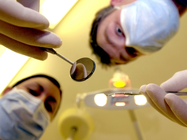
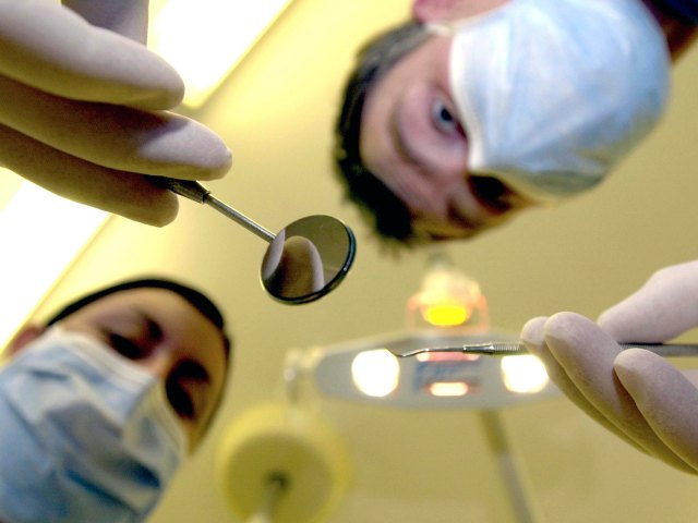
1. An opressive, cluttered spaceOpressive Cluttered spaceAll I could think of to shoot for this one was a cluttered cupboard, but I didn’t really want my cluttered kitchen cupboards on the internet, so thought I would use this one.  It’s an old one I took a few years back, and I’d do a few things differently with the lighting, but I’ve always liked it for the menacing feel to it, as the viewer you feel oppressed by the dentist and his assistant, looming over you ready to get going.

2. An open, honest, simple space containing one intriguing item

An open, honest simple space containing one intriguing object

Okay, so I’m not sure that a snow covered picnic table counts as an “intriguing item” but I like the way it stands out in the scene, reminding the viewer of the summer that’s long gone, but will be back again in a few months.

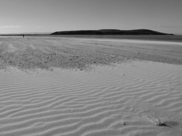
3. A stark, empty, hostile space

Stark, empty, hostile spaceThe empty expanse of sand can look pretty hostile, it could be a desert, with the sun blazing down on a subject who is lost and alone with no help at all, or it could be (and is!) a windswept empty beach, and as you can’t see the town behind the camera, there’s no way to tell how close to civilisation it is.

4. A warm, friendly, cosy environment.

A warm friendly, cosy space

I particularly liked this scene, with it being at Christmas it adds to the warm and cosy feeling of the mother and her daughter cuddling up together, and you can see that both are very content and happy.  I do feel that had this been shot at night it would have added to the warm feel, as the daylight is a bit cold and overpowering in the background.

Project 6: Mise-en-Scene

I’ve had a bit of a break from my Degree work for the past month, but now hope to get stuck back into it – get ready for a batch of posts!

Mise-en-scene refers to how the items or subjects on screen are placed within the scene, in the same way that props or actors are placed on a stage.  All items are placed for a reason, and all space is created for a reason, whether it is to convey a certain meaning or atmosphere, or a particular relationship with another item or subject.

I needed to look at a number of films and look at how they positioned the items on screen, or how they used the space, and to look at the meaning conveyed by the placement and composition.  I’ve also looked at stills related to the films, as well as getting screen grabs to analyse a single frame rather than the full scene.

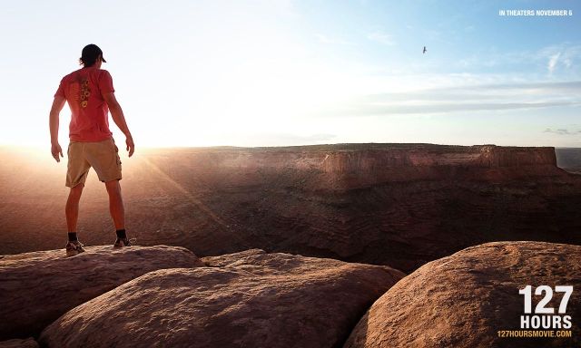
127 Hours

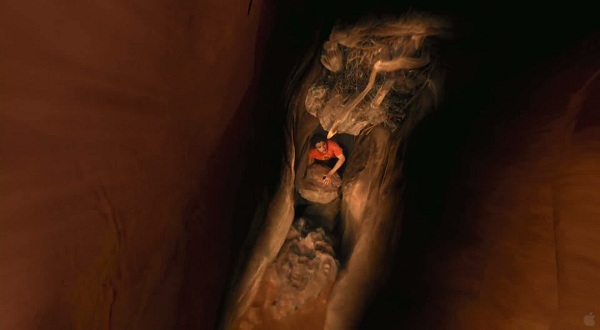
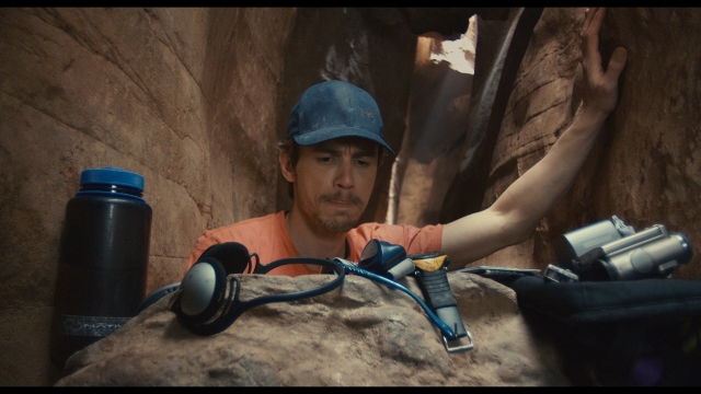
127_hours_wallpaper_3-otherThe positioning of the main character stood on the edge of the canyon, backlit by the low sun is a very positive image, giving a feeling of space and freedom, with no clue to what follows.  The stance of the character is also more relevant if you know the outcome of the film, with him stood with his arms slightly held out, making it pretty clear that at this point, looking down into the canyon, he has 2 arms.  When he does finally make it out of the canyon at the end of the film, he only has one arm left.  1299213625_1Although this has lots of dead space with the sides of the canyon wall, those spaces serve to draw the viewers eye down to the orange t-shirt of the trapped guy, looking small and helpless at the bottom of the canyon.127hours2147This scene has a more cramped and  cluttered feel to it as he pulls the contents of his pack out to see what he has, after getting his right arm trapped between a rock and the canyon wall. Although you can see daylight shining behind him, he’s unable to get to freedom and now has to get used to the idea that he may be there for a while, unless he does something to help himself – which turns out to be having to cut his arm off.

The Princess Bride (I love this film!)

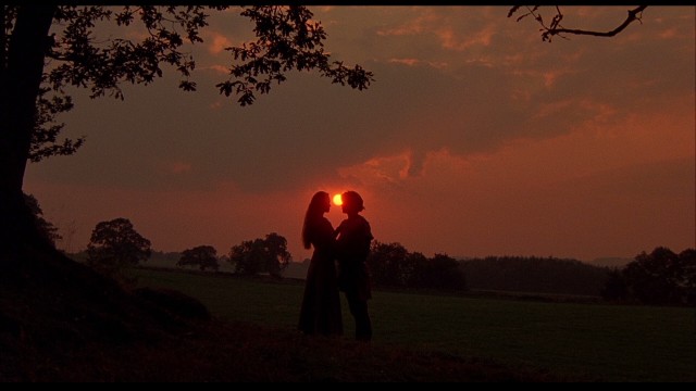
large princess bride blu-ray3This is at the start of the film when Buttercup and Westley first get together, and the subjects have been positioned perfectly to frame the setting sun as they have their first kiss.  The whole scene, has an idyllic feel, with the space around them showing the green fields and trees, and gives no hint to the drama and problems to follow in the film.

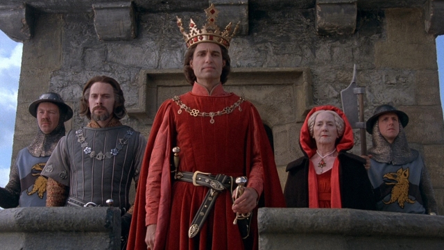
princess-bride-1The arrangement of the characters in this shot is designed to give a sense of power towards the king, separating him at the front of the group.  As the camera is positioned to be looking up at the characters on their balcony, it also gives them more power, and the impression that they are all looking down on the viewer (and the serfs in his land)


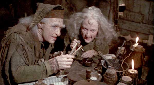
Miracle-Max-and-His-Wife-the-princess-bride-53260_600_331This shot of Miracle Max as he prepares the cure to bring Westley back to life shows him with his wife in his cluttered “lab” where he creates his lotions and potions, and the shot gives the feel of the oppressive cramped nature of his space, you can almost smell the stink!

Digital Film Production: Assignment 1 – Framing

I’m posting this a little out of sequence as there is one more exercise that I should complete from this part of the Digital Film Production course, but as I had the opportunity to film this before the exercise before it, I thought I might as well get it posted!

Introduction

For this assignment I was to produce a short sequence, of no more than 5 shots, telling a simple story, using the images only, and then evaluate my sequence critically, looking at the strengths and weaknesses.

Planning and Pre-production

The sequence I chose was similar to the one I storyboarded for the first exercise of the course – Project One Exercise: Telling a Story about a girl who was feeling a bit down so she went out for a run to cheer herself up.  I re-wrote the storyboard, changing the subject to a man, as I had a willing actor lined up, and I adjusted the location a little, to be able to be able to use my 5 shots effectively.  If I were to have my subject starting from inside their house I would have needed to show them leaving the house, so I decided to start off somewhere outside.

Equipment:

  • Nikon D800 DSLR
  • Tamron 28 – 75mm f/2.8 Lens
  • Manfrotto tripod
  • Pen and paper for taking shot notes
  • Spare battery
  • Spare SD and CF cards

Filming

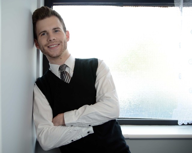
I’ve photographed my actor Andrew before, he’s a professional dancer and model, so I knew that there would be no problems with direction – he’s a natural in front of the camera! As luck would have it, the weather was on my side, with it being a sunny autumn day.  Although I didn’t have a firm idea when I storyboarded it, as to where to film my first shot, I’d decided to use one of the shelters on the seafront.

 Shot 1

Shot 1:

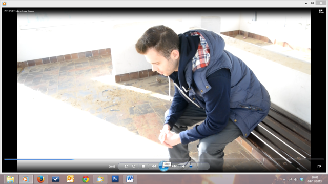
Although I had storyboarded a mid shot I decided to go for something between a mid and a long shot to show a bit more of the subjects surroundings, without showing too much.  I positioned the camera above the subject, to look down on him, and composed it with him off to the side, looking into the screen, rather than straight on looking towards the camera position.

Shot 2

Shot 2:

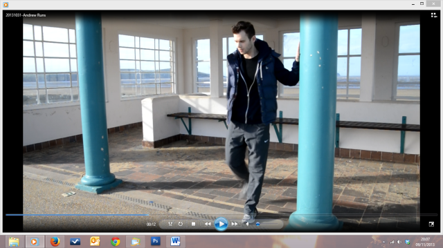
I wanted to get the subject out of the shelter he was in and onto the beach so went for a long shot to reveal a bit more about exactly where he is, and to give him a bit of space to move into and out of at the end of the shot, I used the pillars to create a little bit of a frame, and they came in handy as a prop for him to lean on whilst stretching.  We also took the opportunity to use this shot as a tool for the subject to remove his jacket as he was leaving the shot, allowing us to lose it during the next shot of his feet only.

 Shot 3

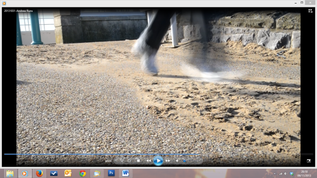
Shot 3:

Although I storyboarded a close up of the subject tying up his laces I decided to change it to a close up of him starting to run.  As I wanted the running shots to be on the sand, I realised I wanted to show the transition from being on the concrete prom, to running on the sand, and also show the transition from standing/walking to running.  I filmed two versions of this shot, one was a much tighter shot, but this meant that the feet weren’t on screen long enough so I tried this version.
Shot 4

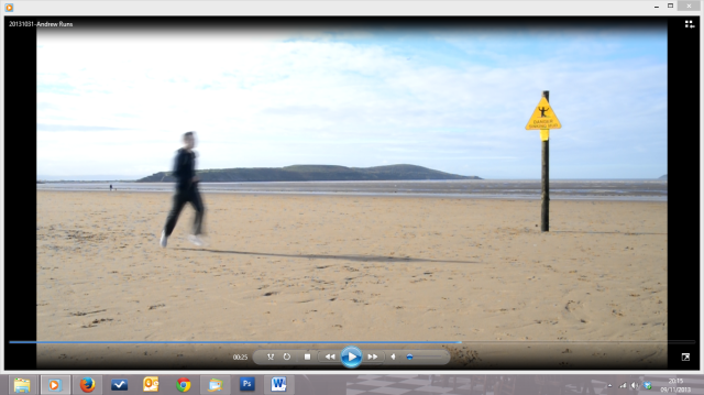
Shot 4:

I wanted this to be a long shot to show the sea and beach, and to also allow the subject to be on screen for a little while, to show a bit of the run. I framed it up to show the sinking mud sign, as I felt the balance worked well.

Shot 5

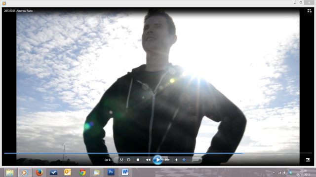
Shot 5

A mid shot, with a low camera angle to make Andrew look empowered by his run, we set up the spot that I wanted him to run into, as I wanted his final position to be with the sun over his shoulder, and he did it spot on in 1 take!

Post Production

With all of the shots I tried to pay attention to the matching/overlapping action to make the edit easier.  The action carried out at the end of one shot, were repeated at the beginning of the next shot, to enable me to edit the shots together easier.  I also kept an eye on the direction that Andrew was moving on the screen, to ensure that I didn’t cross the line, which would have jarred the edits.

Having controlled both of these elements in the filming meant that the edit flowed very well and caused no headaches at all.

Self Assessment

Looking at the assignment, in relation to the assessment criteria set by the Open College of the Arts, I need to assess myself on a number of criteria.

Demonstration of Technical and Visual Skills

Although I’m still trying to get the hang of DSLR filming, I’m reasonably happy with the technical aspects of the piece, although I do need to clean my lens before filming towards the sun!  I made a decision to use the tripod for the whole piece, rather than handheld, which although it restricted any camera moves, it ensured that the shots were all stable.

Quality of Outcome

Controlling the screen direction and overlapping action has given the piece a flow, although as I’m used to longer pieces, it feels too short, and over too quickly.  As it needed to be contained within 5 shots one other option would have been to make one or more of the shots longer, possibly by having a handheld moving shot of him running, moving alongside him, or positioning the camera more head on so he ran towards the camera, although that could have led to a very long, boring shot.

  • Shot 1: I feel that maybe I could have raised the camera even higher above the subject, to emphasise the powerless feeling more.  Alternatively, ad the shot size itself is neither a long shot or a mid shot, perhaps a very wide shot could have made the subject look even more depressed and isolated, although that might have been emphasising it more than is needed.
  • Shot 2: Compositionally I’m reasonably happy with this, although it is a bit of a long, slow shot, which was needed to make the stretches look a little bit more like real life, rather than a 1 second stretch!
  • Shot 3: A bit loose to be a true close up, but it needed to have enough space for him to start running and run out of shot.
  • Shot 4: As mentioned above, although long enough for a static camera shot, I think it needs a bit more of the run, so I would possibly reshoot it with a camera move.  Unfortunately I don’t have a fluid head for my tripod, so would need to try and pan it very carefully.
  • Shot 5:  Other than the dust spots all over the filter, this came out pretty much as I envisaged and I’m happy with the feel of the shot.

Demonstration of Creativity

I’m still trying to find the artiste inside of me, and although technically I’m relatively comfortable, (although still learning all the time) I hope that as the course progresses I can relax into the artistic side of it a bit more.  Although I don’t think I will ever find myself producing wildly abstract work!

Context

I think I need to ensure that I carry out more constructive research, although I am constantly watching television and films with my instructional eye from when I taught video to military photographers and looking at the technical aspects of screen direction, matching action, camera moves etc…., I need to look more at the creative aspects.

Conclusion

Overall I’m quite pleased with how this worked out, although there are minor points that I would adjust, if I were to repeat the exercise, such as maybe lengthening the running shot a little, perhaps by using 2 shots to cover the run, and combine two of the other shots into one.

Project Four: Examples of Camera Angles

The angle that the camera is positioned in relation to the subject can help to give a particular feeling to a shot, and turn a possibly mundane shot into something much more dynamic.  As we see most things at eye-level, positioning the camera at eye height just replicates how we see the world on a daily basis, and whilst this might be suitable for most things, there are times when moving the position of the camera will assist in the narrative.

Eye-Level

a camera positioned eye-level (to the subject, not the camera person) denotes a neutral status, and can be a little bit too "normal"

a camera positioned eye-level (to the subject, not the camera person) denotes a neutral status, and can be a little bit too “normal”

Camera positioned eye-level to the subject, putting the viewer equal to the subject.

Camera positioned eye-level to the subject, putting the viewer equal to the subject.

High Angle

A high angle can show a weakness in the subject, making them seem smaller and less powerful, making the viewer feel superior to the subject

High camera position looking down on the subject, making the subject seem smaller, weaker, less powerful

High camera position looking down on the subject, making the subject seem smaller, weaker, less powerful

A high angle can also be an information shot.

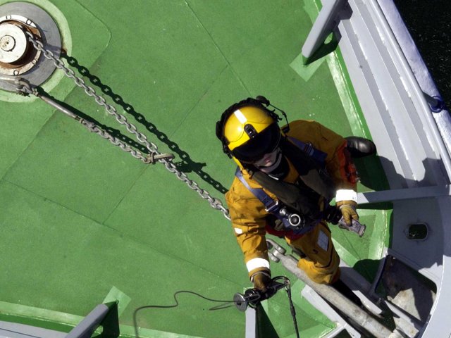
High camera position also provides an information shot, and overview of events that wouldn't normally be seen from eye-level

High camera position also provides an information shot, and overview of events that wouldn’t normally be seen from eye-level

Low Angle

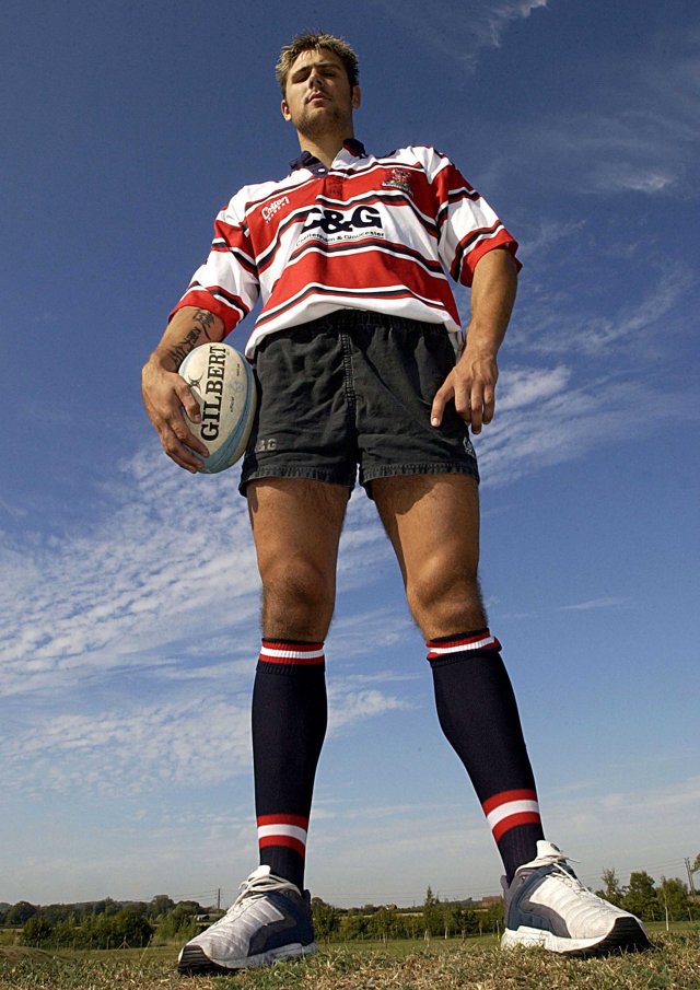
A camera positioned low to the subject, looking up, can make the subject appear more powerful, or dominating, making the view feel inferior to the subject

Low camera position looking up, making the subject seem larger, stronger, more powerful

Low camera position looking up, making the subject seem larger, stronger, more powerful

Extremely low camera position showing the power and dominance of the subject, scarily so!

Extremely low camera position showing the power and dominance of the subject, scarily so as in this menacing dentist shot.  The Point of View (POV) of this dentists unlucky patient, also serves to make the viewer feel uncomfortable – we;ve all been in the position where we’ve been sat waiting for the dentist to start work, and many have a fear of the dentsit.

another camera angle mentioned in the course materials is the “Dutch angle”, a canted, wonky shot, although I have a few reservations about including it in this learning log post for a couple of reasons.  Firstly I don’t think it falls into the same category as the camera angles I’ve already listed, and secondly, I have never (intentionally!) filmed anything during my career at a ridiculous angle, and no matter how much I drag my hidden “artiste” out, I don’t think I’ll be shooting many Dutch angles now!  I do have a couple of stills that I have shot though (intentionally!)

This was shot like this purely to fit the pier and the Red Arrows heart in the frame!

This was shot like this purely to fit the pier and the Red Arrows heart in the frame!

The canted angle in this shot, combined with the low position of the camera makes the subject appear more dominant and powerful.

The canted angle in this shot, combined with the low position of the camera makes the subject appear more dominant and powerful.

Project Three: Exercise – Shooting a short sequence

For this exercise I was to plan and produce a short sequence along the lines of the following:

You are an alcoholic alone in your home
• You look around your empty room
• Nothing interests you
• You notice a bottle
• You hold the bottle and unscrew the lid
• Something attracts your attention, you look round
• Nothing happens
• You look back at the bottle and pour yourself a drink.

Firstly,as it was to be shot in the first person, POV (with the camera as my eyes) I decided to change the scenario a little as I don’t drink, and didn’t fancy having to take a drink, so I changed it to a biscuit addict 🙂

The main information that I wanted to convey, was of someone looking for something, and needed to highlight finding something that wasn’t wanted, followed by finding the wanted item. (if that makes sense!)  I carried out a couple of rough run throughs, before I committed pen to paper for the storyboards, to clarify in my head the shots that I wanted.  Below is my storyboard:

I wanted it to be properly a point of view shot, so didn’t want to use a tripod, and wanted a touch of the “shakycam” that I have never been a fan of, but I felt that being on a tripod it would be too static, and not emphasise the point of view enough.

I shot two versions – one was done as a single shot, with no cuts, to emphasise the first person, changing the shot size by walking towards a subject.  The main problem with this was keeping the focus when going from wide to close up shots, it’s not easy when shooting on a DSLR with one hand, wholst using the other hand in the shot to open a biscuit barrel! Luckily I do have a cheapo should rig so I was able to use two hands to unscrew the barrel lid.

In this version I didn’t do shot one, with my hand opening  the door, I felt it added an extra complication.

Version One: Single shot POV

Although I think this works to highlight the POV style, with lots of movement, my background still causes me to struggle with the shakiness of the shots!

Version Two – Edited POV

With this version the cuts are dipping to black to look a bit like when you blink, and you temporarily lose sight of whats in front of you.  I felt that this worked as a good tool to get me (or my character) from just inside the room, to a cupboard, then to the biscuits etc…. (Apologies for the blown out exposure, I didn’t look quite that bad when filming and editing, something I’ll need ot look at to make sure my colour/exposure management is okay across the board from camera to YouTube!)

I think I do prefer the second version, eliminating the moves between shots and shot sizes makes it look a little less jumpycam.  I could improve this dramatically with a steadycam rig, but unfortunately my budget doesn’t stretch that far.  I could have maybe also used another shot or two of rooting through cupboards, to build up the panic of the subject not being able to find the biscuits!

Project Three – The Feel of the Frame

How a frame is composed can influence how the viewer understands the narrative, and can also influence how they feel about a particular character or situation on screen.

The balance of the composition can be affected by a number of things, such as light, shape and the size of the subject in the frame, and in relation to the surroundings, and the positioning of the subject.

For this reflective exercise I needed to find a number of frames, either film stills, photographs or paintings and analyse the image. I decided to go with stills from a number of my favourite films:

Schindlers List

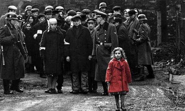
There are two particular frames from two of the most emotive parts of the film.  The first is from when Schindler is up on a hill, watching German soldiers were dealing with the liquidation of the Jewish ghetto in Krakow, and the small girl is a brief flash of colour in amongst the dark, monochrome scene.

Schindler's List, Oliwia DabrowskaThe combination of the selective colour (which I’m not a fan of anywhere other than in this film!) and the apparent isolation of the little girl, wandering through the crowds of soldiers and Jews, looking lost and alone.  It makes the viewer wonder what her back story is, and how she has been separated from her family, and what will her future be.  Although there is a lot going on on-screen, with other people, the viewer eye keeps going back to her, not only because of the red coat, but also the way she seems separated from the main group.  Also the height difference singles her out from the rest.

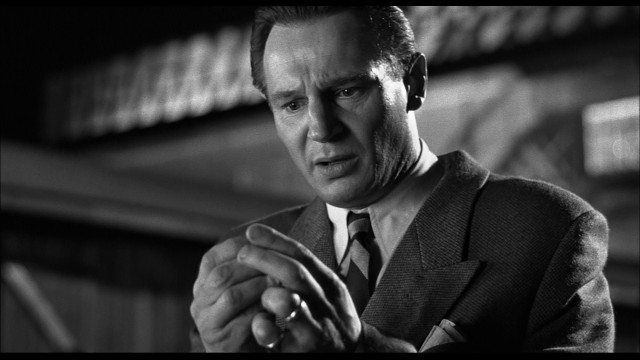
Another images from Schindlers List is taken from the scene where Oskar Schindler finally realises what he has actually done.  From initially getting the jews out of the camps to use in his factory, he realises how many he has saved, and how many he could have saved had he paid the Germans even more money.

schindler-s-list-original

In this frame he is looking at a Nazi pin badge he wore, and realising it is made of gold, he equates the worth of it to how many Jews he could have bought out of a concentration camp.  the framing of the image isolates Oskar, separates him from everything else in the scene, concentrating on the important element – the emotional pain on his face, with the badge held at the front, his attention directed towards it, directing the viewer to think about the same object.


28 Days Later

28_days_later_still2

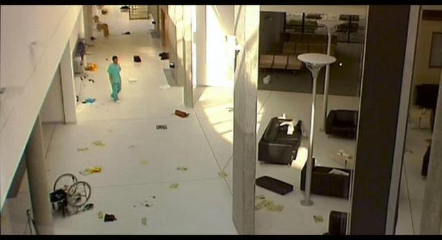
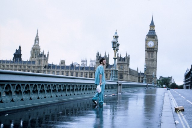
Similar to the shot of the little girl in the red coat, the framing of this shot also isolates the subject, but this time to show the emptiness of his surroundings.  He’s just come out of a coma, to find he is in an empty London, and the wide shots, with the subject small in the frame makes him seem helpless and alone.

1_28-Days-Later-Medium

This shot after he has left the hospital continues to show his isolation, now on the streets of London.

The Shining

close-up-the-shining

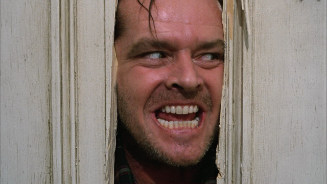
Although I’ve never seen the film (true!) this particular shot is so well known, and I thought it would be a good example as I have no knowledge of the film, so can’t link in to the action before or after it. The framing of the subject, framed in the broken doorway, combined with the aggressive, maniacal expression on his face, shows the terror that must be going on off screen, involving the other characters.  You can see the evil pleasure that the subject is getting from the fear he is creating.

Hurt Locker

hurt-locker-5

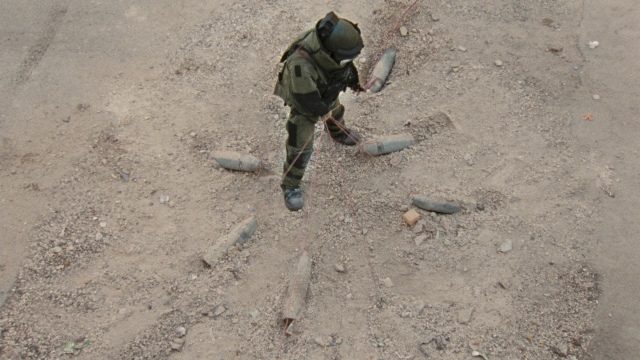
I seem to have been drawn to images showing a single main character, and with this shot from the Hurt locker it shows both the strength and the vulnerability of the subject, and the role of a bomb disposal expert in general.  The high angle shows exactly what he is up against, the IEDs surrounding him.

thehurtlocker1

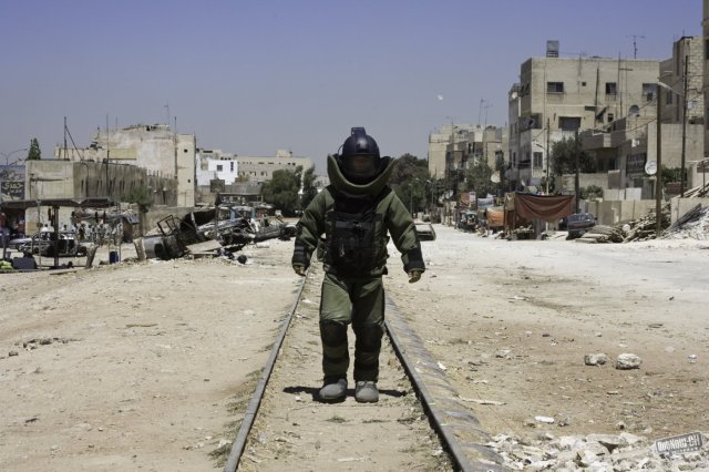
In the second frame it shows the power of the bomb disposal guy, but also as in the other shot, the isolation.  It’s a role that can only be carried out alone, and this frame shows that very well.